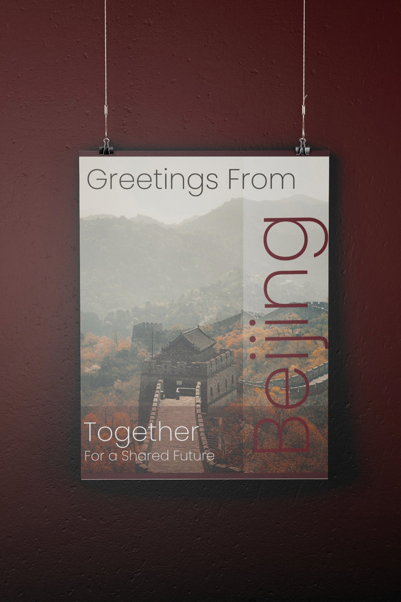
This flyer was designed to promote the theme "Together for a Shared Future," with a strong visual emphasis on Beijing, symbolized by the iconic Great Wall. My goal was to create a welcoming, visually appealing piece that communicates a sense of unity and connection while showcasing the beauty of Beijing. The autumnal color palette, featuring warm oranges and deep browns, reflects both the natural landscape and a sense of warmth and cooperation. The layout keeps the message simple and straightforward, focusing on the beauty of the setting and the importance of shared global values.
Mood Board
Approach
For this flyer, I chose the Poppins typeface for its modern, clean, and approachable look, adding clarity and professionalism while maintaining a friendly tone. Poppins balances the bold imagery of the Great Wall with elegant typography that doesn’t overpower the visuals. A scenic photo of the Great Wall surrounded by autumn foliage evokes history, natural beauty, and connection, with warm oranges and browns symbolizing warmth and cooperation. Large vertical typography for "Beijing" and a transparent overlay integrate the text with the image seamlessly. The overall design aims to be welcoming, visually engaging, and reflective of cultural heritage and unity.
Final Result
The final flyer was designed to promote the theme “Together for a Shared Future,” with a strong visual focus on Beijing, represented by the iconic Great Wall. The design aims to be welcoming and visually engaging while conveying a sense of unity, connection, and global cooperation. An autumn-inspired color palette of warm oranges and deep browns reflects the natural beauty of the landscape and reinforces feelings of warmth and collaboration. The clean, straightforward layout keeps the message clear and impactful, allowing the imagery to highlight both the significance of Beijing and the importance of shared global values.
This flyer was designed to promote the theme "Together for a Shared Future," with a strong visual emphasis on Beijing, symbolized by the iconic Great Wall. My goal was to create a welcoming, visually appealing piece that communicates a sense of unity and connection while showcasing the beauty of Beijing. The autumnal color palette, featuring warm oranges and deep browns, reflects both the natural landscape and a sense of warmth and cooperation. The layout keeps the message simple and straightforward, focusing on the beauty of the setting and the importance of shared global values.
Mood Board
Approach
For this flyer, I chose the Poppins typeface for its modern, clean, and approachable look, adding clarity and professionalism while maintaining a friendly tone. Poppins balances the bold imagery of the Great Wall with elegant typography that doesn’t overpower the visuals. A scenic photo of the Great Wall surrounded by autumn foliage evokes history, natural beauty, and connection, with warm oranges and browns symbolizing warmth and cooperation. Large vertical typography for "Beijing" and a transparent overlay integrate the text with the image seamlessly. The overall design aims to be welcoming, visually engaging, and reflective of cultural heritage and unity.
Final Result
The final flyer was designed to promote the theme “Together for a Shared Future,” with a strong visual focus on Beijing, represented by the iconic Great Wall. The design aims to be welcoming and visually engaging while conveying a sense of unity, connection, and global cooperation. An autumn-inspired color palette of warm oranges and deep browns reflects the natural beauty of the landscape and reinforces feelings of warmth and collaboration. The clean, straightforward layout keeps the message clear and impactful, allowing the imagery to highlight both the significance of Beijing and the importance of shared global values.
This flyer was designed to promote the theme "Together for a Shared Future," with a strong visual emphasis on Beijing, symbolized by the iconic Great Wall. My goal was to create a welcoming, visually appealing piece that communicates a sense of unity and connection while showcasing the beauty of Beijing. The autumnal color palette, featuring warm oranges and deep browns, reflects both the natural landscape and a sense of warmth and cooperation. The layout keeps the message simple and straightforward, focusing on the beauty of the setting and the importance of shared global values.
Mood Board
For this flyer, I chose the Poppins typeface for its modern, clean, and approachable look, adding clarity and professionalism while maintaining a friendly tone. Poppins balances the bold imagery of the Great Wall with elegant typography that doesn’t overpower the visuals. A scenic photo of the Great Wall surrounded by autumn foliage evokes history, natural beauty, and connection, with warm oranges and browns symbolizing warmth and cooperation. Large vertical typography for "Beijing" and a transparent overlay integrate the text with the image seamlessly. The overall design aims to be welcoming, visually engaging, and reflective of cultural heritage and unity.
The final flyer was designed to promote the theme “Together for a Shared Future,” with a strong visual focus on Beijing, represented by the iconic Great Wall. The design aims to be welcoming and visually engaging while conveying a sense of unity, connection, and global cooperation. An autumn inspired color palette of warm oranges and deep browns reflects the natural beauty of the landscape and reinforces feelings of warmth and collaboration. The clean, straightforward layout keeps the message clear and impactful, allowing the imagery to highlight both the significance of Beijing and the importance of shared global values.